
The 5-Second Rule: How to Create Custom Signage That Stops Traffic and Drives Sales
- Lindsay Miller
- Jan 2
- 5 min read

Picture this: A potential customer walks past your storefront, drives by your billboard, or enters your trade show booth. You have exactly five seconds: maybe less: to capture their attention, communicate your message, and convince them to take action. Miss that window, and they're gone forever.
This is the reality of the 5-second rule in signage design, and it's the difference between signage that generates results and expensive decorations that get ignored. Whether you're designing outdoor banners, storefront signs, trade show displays, or vehicle wraps, understanding and applying this rule can transform your marketing ROI.
What Exactly Is the 5-Second Rule?
The 5-second rule states that any sign must communicate its core message in five seconds or less. This isn't marketing theory: it's based on real-world behavior. A driver traveling at 55 mph sees your billboard for about 5-7 seconds max. A pedestrian glances at your storefront sign for even less time before their attention shifts elsewhere.
This time constraint forces you to strip away everything non-essential and focus on what truly matters: getting your message across instantly and memorably.
Why Your Brain Processes Signs This Way
Our brains are wired to make split-second decisions, especially when we're in motion or surrounded by distractions. In busy commercial environments, people operate in "scanning mode": quickly evaluating whether something deserves their attention. Complex, cluttered signage forces viewers to work harder to understand your message, and most simply won't bother.
Think about the last time you drove through an unfamiliar area looking for a specific business. You probably ignored elaborate signs with tiny text and multiple messages, while simple, clear signage immediately caught your eye. That's the 5-second rule in action.
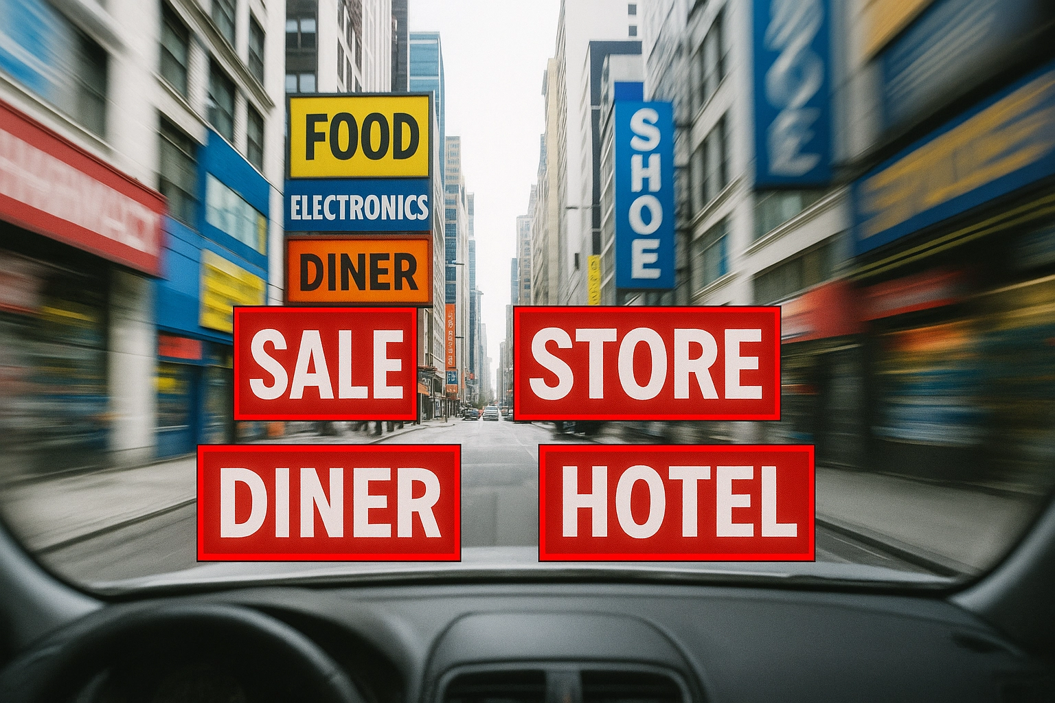
The Foundation: One Message, One Purpose
The biggest mistake businesses make is trying to communicate everything at once. Your sign can't simultaneously advertise your sale, list your services, provide directions, and build brand awareness. Pick one primary goal per sign.
Effective single-message examples:
"Now Open" (announcement)
"Drive-Thru Available" (service highlight)
"50% Off Everything" (promotion)
"Next Exit" (directional)
Each sign has one job. When you try to make a sign do everything, it accomplishes nothing.
Typography That Actually Gets Read
Your font choices can make or break the 5-second rule. Here's what works:
Size Matters More Than Style Follow the "1 inch per 10 feet" rule. If your target viewer is 80 feet away, your letters need to be at least 8 inches tall. Many businesses underestimate viewing distance and end up with unreadable signage.
Stick to Simple, Bold Fonts Decorative fonts might look sophisticated in your design software, but they're often illegible from a distance or at speed. Choose clean, bold typefaces like Arial, Helvetica, or custom fonts specifically designed for signage.
High Contrast Is Non-Negotiable Dark text on light backgrounds or light text on dark backgrounds. Avoid color combinations that strain the eyes or reduce legibility in different lighting conditions.
The Power of Strategic Word Count
Here's where most signs fail: too many words. The sweet spot for effective signage is 3-7 words maximum. This forces you to use strong, action-oriented language and eliminate filler words.
Instead of: "We offer professional automotive repair services for all makes and models with certified technicians" Try: "Expert Auto Repair"
Instead of: "Visit our store for a wide selection of fresh, locally-sourced organic produce" Try: "Fresh Local Organic"
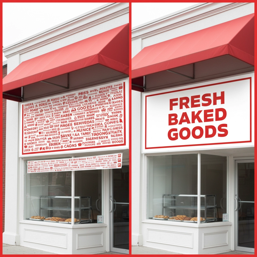
Every word must earn its place. If you can remove a word without losing meaning, remove it.
Visual Elements That Accelerate Understanding
Sometimes images communicate faster than words. A well-chosen graphic can instantly convey your message while text is still being processed. Universal symbols work especially well:
Arrows for direction
Phone icons for contact information
Shopping bags for retail
Tools for services
Food imagery for restaurants
The key is choosing visuals that are immediately recognizable and culturally universal to your target audience.
Color Psychology in Quick Decision Making
Colors trigger emotional responses within milliseconds, making them powerful tools for the 5-second rule. Red creates urgency and grabs attention: perfect for sales or limited-time offers. Blue builds trust and works well for professional services. Green suggests growth, health, or environmental friendliness.
But remember: color choices must also support readability. A beautiful color scheme that reduces contrast defeats the purpose.
Strategic Placement and Positioning
Even perfectly designed signage fails without proper placement. Consider these factors:
Viewing Angle Signs should be angled slightly toward approaching viewers rather than mounted completely perpendicular to walls or posts.
Height Optimization Position signs at eye level for your target audience. Pedestrian signs work at different heights than signs meant for drivers.
Environmental Context Account for obstacles, competing signage, lighting conditions, and seasonal changes that might affect visibility.

Testing Your 5-Second Signage
Before investing in production, test your design:
The Walking Test Print your design at actual size (or proportionally scaled) and have someone walk past it at normal speed. Can they understand the message without stopping or slowing down?
The Glance Test Show your design to people for exactly five seconds, then ask them to repeat the main message. If they can't, simplify further.
The Distance Test View your design from the actual distance where your target audience will see it. Small details that look good up close often disappear from realistic viewing distances.
Real-World Applications for Different Industries
Retail Stores Focus on key differentiators: "Same Day Alterations" or "Open Sundays" communicate unique value quickly.
Restaurants Highlight signature items or service style: "Wood-Fired Pizza" or "Drive-Thru Open Late" tell customers exactly what to expect.
Professional Services Emphasize credentials or specialties: "Board Certified" or "Free Consultation" build trust and encourage action.
Events and Trade Shows Create curiosity or highlight benefits: "Live Demo Every Hour" or "Win an iPad" draw people to your booth.
Common 5-Second Rule Mistakes to Avoid
Information Overload Listing every service, product, or feature defeats the purpose. Save detailed information for brochures, websites, or follow-up materials.
Inside Jokes or Clever Wordplay What seems creative to you might be confusing to customers. Clarity always trumps cleverness in signage.
Assuming Context Don't assume viewers know what your business does. "Johnson & Associates" tells people nothing, while "Johnson Tax Services" immediately communicates value.
Ignoring Mobile Viewers More people than ever are viewing your signage while walking and looking at their phones. This makes the 5-second rule even more critical.
Measuring Success Beyond the 5-Second Rule
Effective signage should drive measurable results. Track metrics like:
Foot traffic increases after installing new signage
Phone calls or website visits mentioning your signs
Sales of specifically promoted items
Customer feedback about finding your location
Making the 5-Second Rule Work for Your Business
The 5-second rule isn't a limitation: it's a competitive advantage. By forcing clarity and focus, you create signage that cuts through noise and connects with customers instantly. Whether you need storefront signs, vehicle wraps, trade show banners, or promotional displays, applying these principles will maximize your marketing investment.
Ready to create signage that stops traffic and drives sales? The experts at Ink N Stitch specialize in translating the 5-second rule into powerful custom signage solutions. From concept to installation, we help businesses communicate more effectively through strategic design. Contact us today to discuss how professional signage can transform your marketing results.
Comments