
7 Mistakes You're Making with Custom Signage (and How to Fix Them)
- Lindsay Miller
- Jan 14
- 5 min read

Your custom signage is often the first impression customers get of your business – but are you making critical mistakes that could be driving potential clients away? 😬 Don't worry, you're not alone! Even the most well-intentioned business owners can fall into these common signage traps.
Let's dive into the seven biggest signage mistakes we see every day and, more importantly, how you can fix them to create eye-catching displays that actually work for your business! 🚀
1. Information Overload: Cramming Everything onto One Sign 📚
The Mistake: You've got so much to say about your amazing business that you try to fit it all on one sign. Your hours, services, phone number, website, social media handles, awards, and that catchy slogan you spent weeks perfecting – it all goes on there!
Why It's Hurting You: When customers have just seconds to process your message while driving by or walking past, a cluttered sign becomes visual noise. Instead of attracting attention, you're creating confusion and overwhelm.
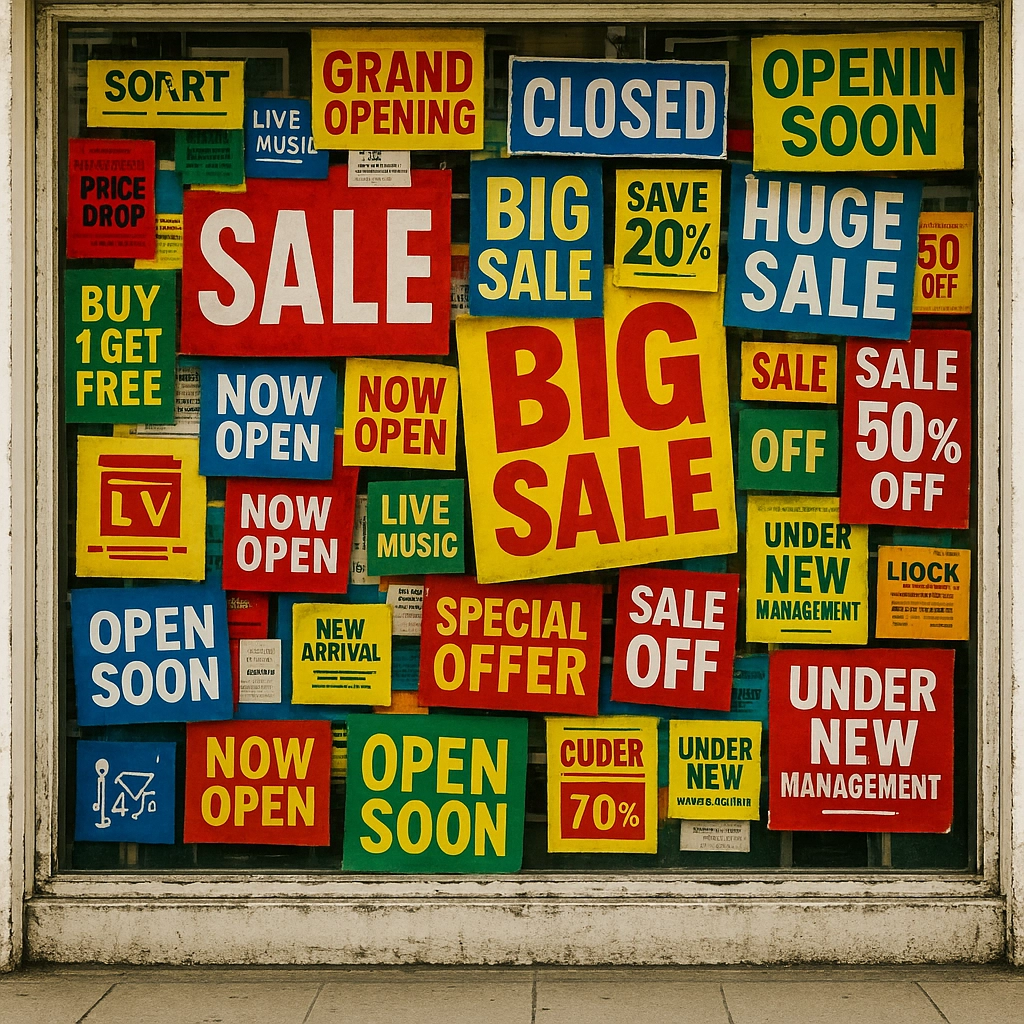
The Fix: Keep it simple and powerful! Stick to the essentials – your business name and one key message. Think of your sign as a movie trailer, not the entire film. You want to intrigue people enough to come inside or visit your website for more details.
Pro Tip: Limit yourself to 5-6 words per line with no more than 2-3 lines total. Your sign should communicate your core message at a glance!
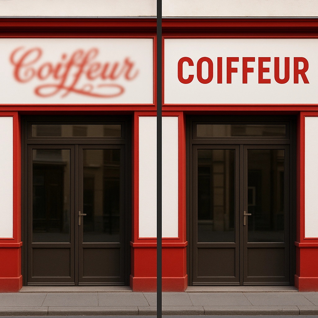
2. Font Fiasco: Choosing Style Over Substance ✏️
The Mistake: That fancy script font looks gorgeous on your computer screen, so it'll definitely make your business look elegant and sophisticated, right? Wrong!
Why It's Hurting You: Decorative fonts that look beautiful up close often become completely illegible from a distance. If people can't read your sign, they can't become your customers.
The Fix: Choose clear, bold fonts that prioritize readability over artistic flair. Sans-serif fonts are your best friends for outdoor signage – they're clean, professional, and easy to read from any distance.
Test It Out: Before committing to a font, test it at various distances and lighting conditions. Can you read it clearly from across the street? What about when the sun is setting behind it? If there's any doubt, choose a bolder option!
3. Color Chaos: Random Color Combinations That Don't Work 🎨
The Mistake: You love purple, your business partner loves orange, and that green really pops – so why not use them all together?
Why It's Hurting You: Poor color combinations can make your text disappear against the background or create eye strain that makes people look away. Colors that clash or don't provide enough contrast will sabotage even the best design.
The Fix: Focus on high contrast combinations that make your text pop! Think black on white, white on dark blue, or yellow on black. Your colors should also align with your brand identity and industry expectations.
Quick Color Test: Squint at your design or view it in grayscale. If you can still clearly see the text and important elements, you've got a winner!
4. Size Matters: Getting Your Measurements All Wrong 📏
The Mistake: You measured once (or maybe just eyeballed it) and ordered a sign that seemed like a good size. Now it either looks like a postage stamp on your building or it's so massive it violates city codes.
Why It's Hurting You: A sign that's too small gets lost and ignored. A sign that's too large can look unprofessional or create legal issues. Either way, you're not getting the visibility and impact you paid for.
The Fix: Follow the golden rule of "measure twice, cut once"! Consider your viewing distance, building proportions, and local regulations. A professional sign company can help you determine the perfect size for maximum impact and compliance.
Distance Rule: For every 10 feet of viewing distance, you need approximately 1 inch of letter height. So if customers will see your sign from 100 feet away, your letters should be at least 10 inches tall!
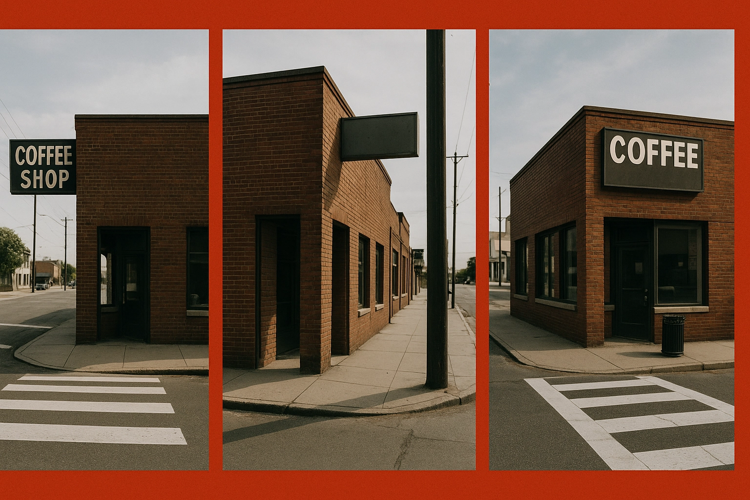
5. Blind Spots: Ignoring Critical Viewing Angles 👁️
The Mistake: Your sign looks perfect when you're standing directly in front of your building, but what about from the angles your customers actually approach from?
Why It's Hurting You: Signs that can't be seen from key approach routes or traffic patterns might as well be invisible. You're missing opportunities to attract customers who could be driving or walking by from different directions.

The Fix: Take a walk (or drive) around your location at different times of day. Where do customers naturally approach from? Are there any obstructions like trees, other signs, or building features blocking the view? Position your signage to maximize visibility from these critical angles.
Multi-Direction Strategy: If your business is on a corner or faces multiple directions, consider multiple signs or a sign that's visible from various approaches!
6. Installation Issues: Taking Shortcuts That Cost You 🔧
The Mistake: DIY installation or hiring the cheapest option without considering quality and safety standards.
Why It's Hurting You: Poor installation leads to premature wear, safety hazards, and signs that look unprofessional. Moisture can seep into improperly sealed signs, causing damage, rust, and fading that shortens your sign's lifespan dramatically.
The Fix: Invest in professional installation that follows manufacturer specifications and local building codes. Proper mounting, sealing, and positioning will protect your investment and ensure your sign continues looking great for years to come.
Safety First: Professional installers understand weight distribution, weather resistance, and electrical requirements for illuminated signs. Don't put your customers, employees, or property at risk!
7. Legal Headaches: Ignoring Local Regulations ⚖️
The Mistake: You designed the perfect sign and had it installed, only to receive a citation from city officials requiring expensive modifications or complete removal.
Why It's Hurting You: Every municipality has specific regulations about sign size, height, illumination, and placement. Ignoring these rules can result in fines, forced removal, and the cost of starting over from scratch.
The Fix: Research local sign ordinances before you design and install! Work with a professional sign company familiar with your area's zoning laws. They can help you navigate permits, restrictions, and compliance requirements from the start.
Get Ahead of the Game: Contact your local zoning office early in the planning process. It's much easier to design within regulations than to modify or replace non-compliant signage later!
Transform Your Signage Game Today! 🎯
Don't let these common mistakes sabotage your business visibility and customer attraction! The good news? Every single one of these issues is completely preventable with proper planning and professional guidance.
Your signage is working 24/7 to represent your business and attract customers – make sure it's doing its job effectively! Whether you need custom vinyl signs or want to explore other promotional options, investing in quality signage design and installation pays dividends in increased visibility and customer traffic.
Ready to create signage that actually works for your business? Let's turn those missed opportunities into new customers with signage that demands attention for all the right reasons! 🌟
this is great